
IDEO · CREATIVE DIRECTOR · CONTENT DIRECTOR · UX · PLATFORM DESIGN
2 people. 80,000 educators. Still on classroom walls 15 years later.
How might we design a toolkit that actually works inside the reality of a teacher's day, not the idealized version of one?
80,000+
educators reached
languages (educators around the world translated it themselves)
8
MOOC participants through Edutopia
3,000+
The challenge
❋
The first version had value. Teachers were using it, but it wasn’t sticking.
It was too dense and too far from the pace of a real classroom. Design thinking in education was still an idea, not a practice teachers could see or apply in real time.
The approach
✹
I redesigned the system from the inside out.
That meant building multiple entry points, from quick exercises to full curriculum, so teachers could engage based on the time they actually had. I grounded the work in real teacher stories, showing what design thinking looked like in practice, not theory.
The system was built to meet teachers where they were, and move with them as they went deeper.
What I owned
✱
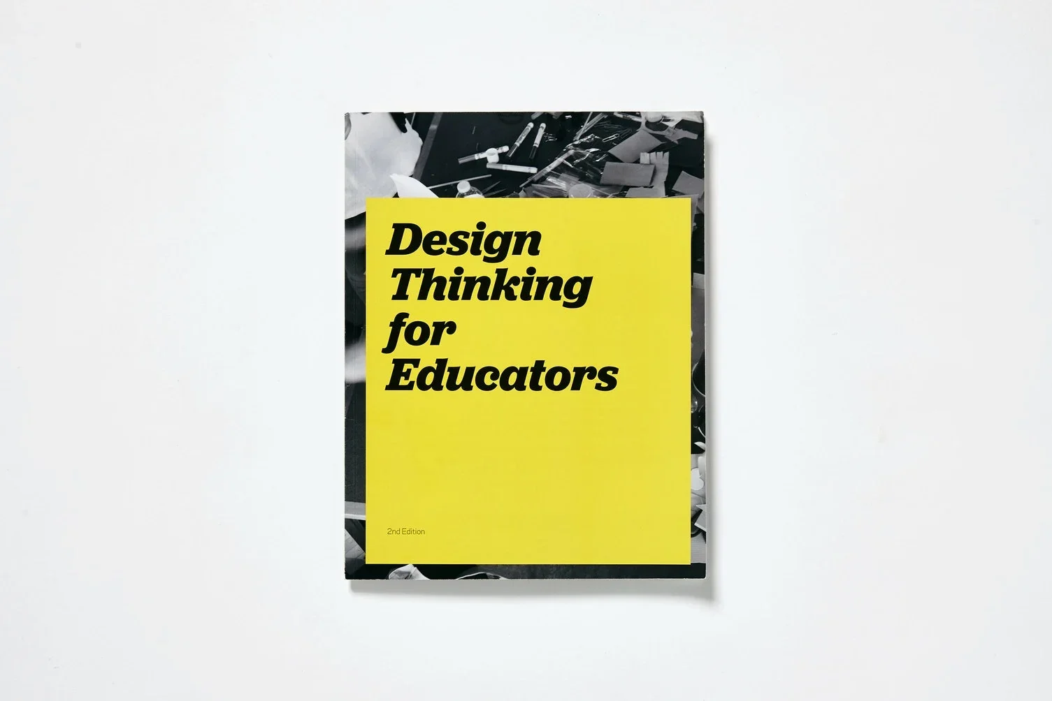
End-to-end toolkit redesign across platform, content, and structure
Video series as Creative Director and Content Director
Workbooks and classroom-ready design challenges
Teacher story library grounded in real classrooms
Partnerships with Riverdale Country School and Edutopia
A MOOC and large-scale educator workshops
The impact
✥
The toolkit reached over 80,000 educators and spread globally through translations into 8 languages, driven by teachers who wanted to use it in their own communities. It expanded into a MOOC with 3,000+ participants and large-scale workshops. Nearly 15 years later, the work is still in classrooms, shaping how teachers approach learning, all built and scaled by a 2-person team.
The tradeoffs
❉
The tension was between rigor and usability. The toolkit needed to be credible to educators and simple enough to use in limited time.
Every decision required cutting content while keeping the core intact. The system had to move quickly enough to engage a tired teacher and hold enough depth to be taken seriously.
The takeaway
❊
The work wasn’t about adding more content. It was about access. Making sure the right ideas reached people in a way they could actually use.