
DIRECTOR OF UX & CREATIVE · BRAND · AI CONVERSATION DESIGN · PRODUCT STRATEGY
Designing an AI health platform for women navigating perimenopause and menopause.

How might we build a precision health platform that could serve as both educator and advocate for women whose care system had left them without either?
from ground zero to working prototype
6 months
building brand, UX, AI conversation design, and user research simultaneously
1 founding team
The challenge
❋
Women in this phase were largely on their own. Even the most proactive were piecing together information from fragmented sources, while struggling to get support from a system that wasn’t built to help them.
The information existed. What was missing was a way to access it in moments when users were dealing with brain fog, fatigue, and cognitive overload.
The approach
✹
I led early design sprints to test whether the space had real traction, then built the product around what we learned.
The direction shifted quickly. A symptom tracker wasn’t enough. The product needed to act as both educator and advocate, helping users understand what was happening in their bodies while supporting them in clinical conversations.
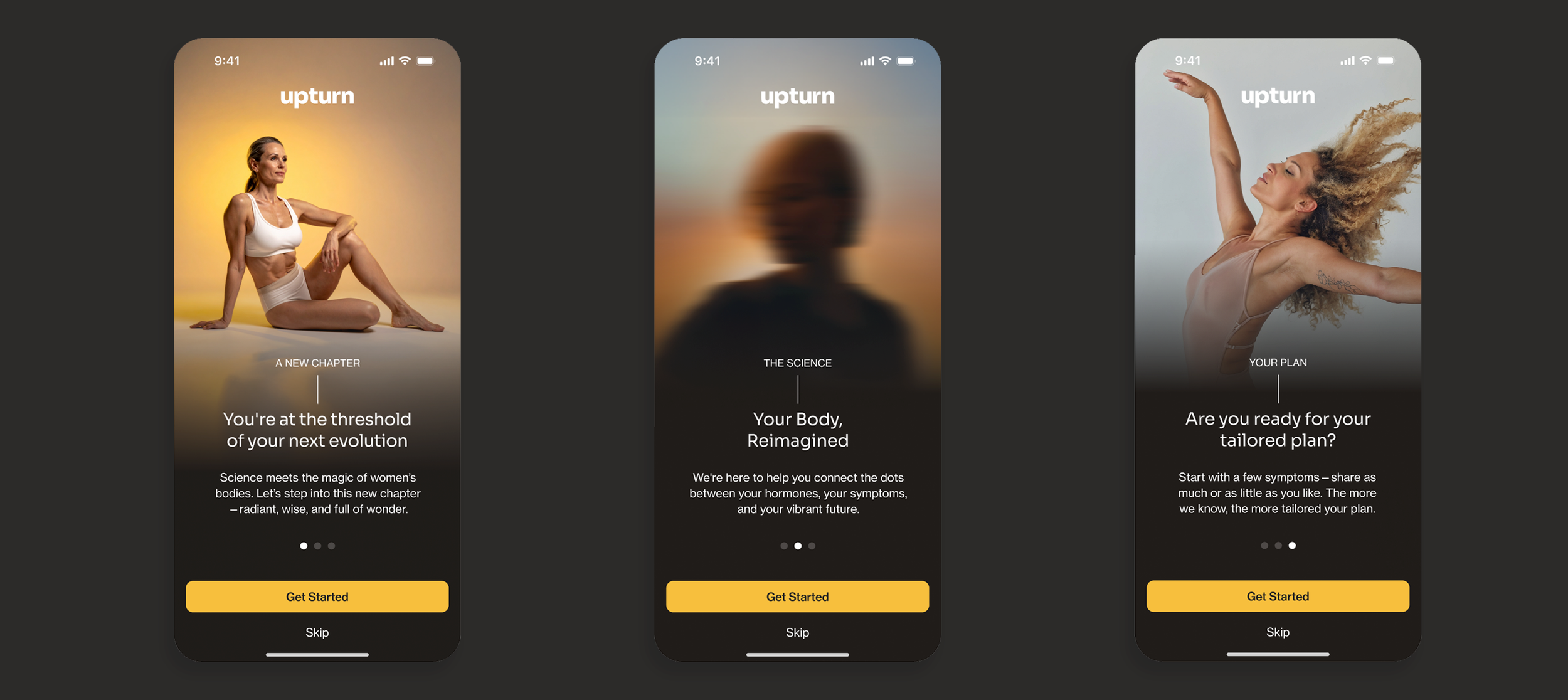
I directed design for the full experience, from brand to AI interaction. This included conversation design for the AI, shaping how it spoke, what it prioritized, and how it responded to users who were often confused and exhausted.
What I owned
✱
Brand direction and creative system
AI conversation design, tone, and logic
End-to-end UX, from wireframes to prototype
Early AI-native prototyping workflows
User research and validation sprints
Direction and management of an overseas development team
The impact
✥
The product moved from concept to working prototype in 6 months. The work validated demand in a space where users were actively searching for support but lacked usable tools.
The design system held through a later shift from consumer-facing to physician-supported use, because it was grounded in real user needs rather than a fixed go-to-market model.
The trade-offs
❉
The core tension was between depth and usability. The science is complex. Users often needed answers in moments when they couldn’t process complexity.
Every decision required balancing accuracy with clarity. The product had to be rigorous enough to trust, and simple enough to use on a bad day.
The takeaway
❊
Designing for this space means designing for people at their most vulnerable. When the experience breaks, the consequences are real. That standard shaped every decision.